ClaimReady — designed for the worst day
A roadside collision-reporting iOS app, for the driver who has just been in an accident — shaken, one-handed, in traffic. Ten guided steps walk them through photos, positions and statements, so the report is complete before the tow truck arrives. "Banking meets emergency service" — 12 screens, one clickable prototype.
iOS
375 × 812 · SF Pro
12
Screens
10
Guided Steps
Live
Clickable
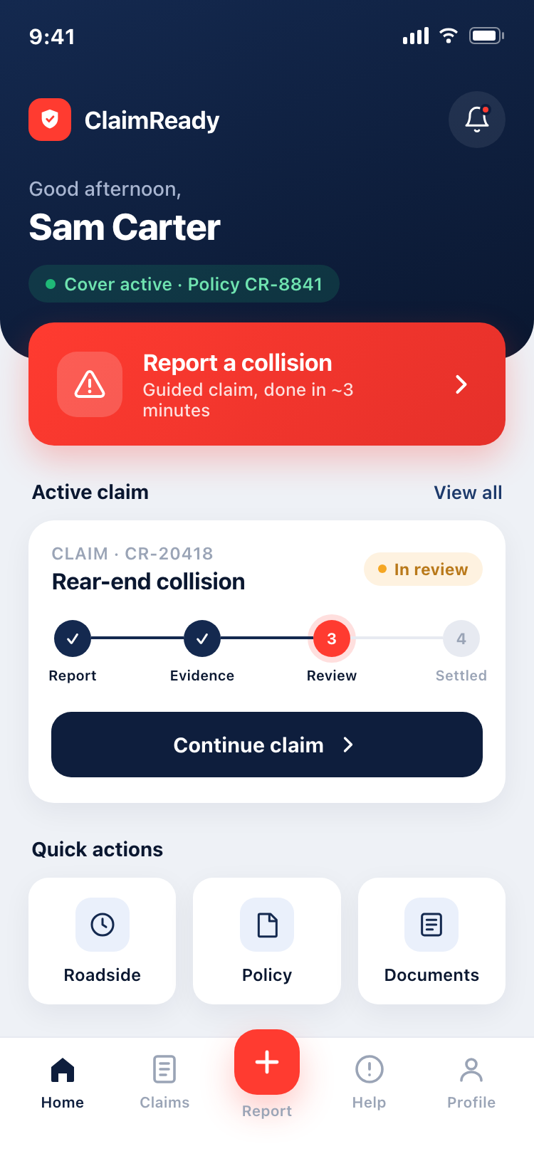
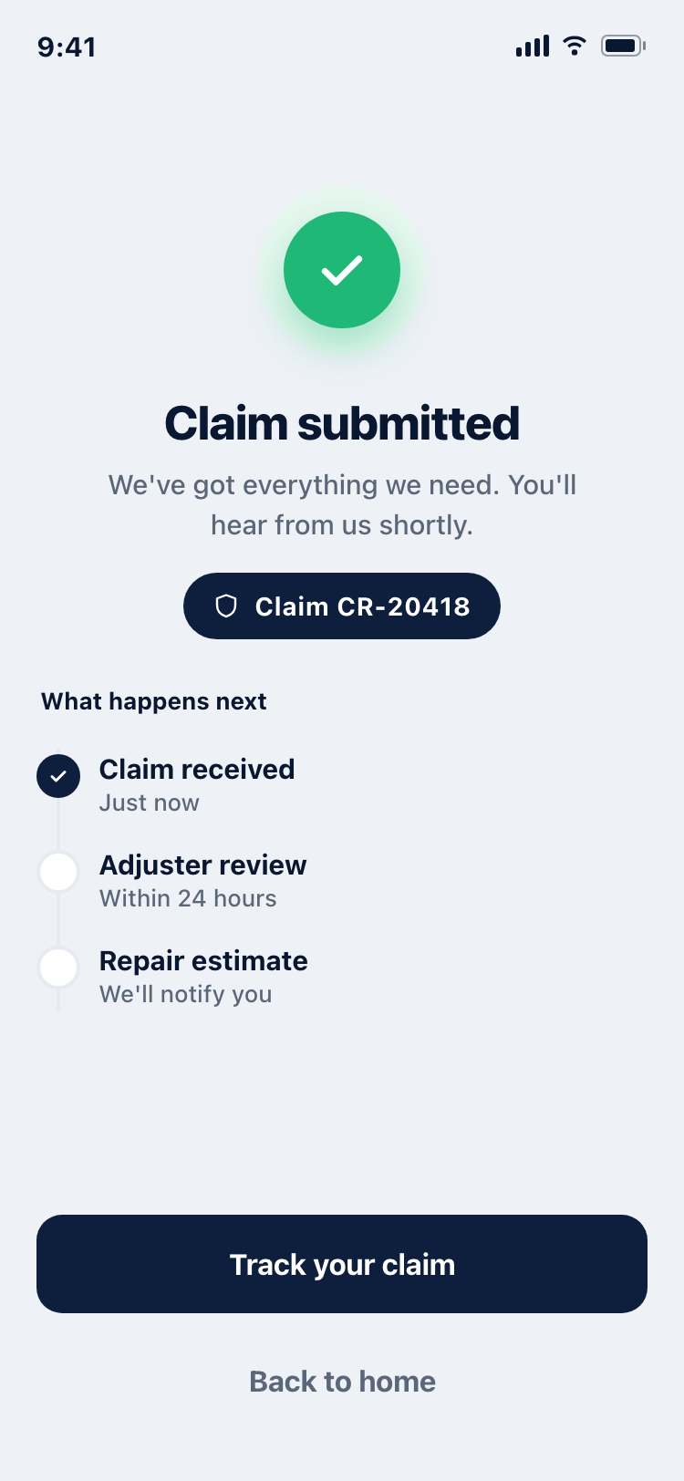
The starting point was a real founder brief: a mobile app to report a collision at the roadside, the moment after an accident. The visual direction was given in one line — "Think banking meets emergency service: deep navy, red accent, clean and fast."
The design challenge sits in that tension. The user is stressed, possibly shaken, standing on the side of a road. The app has to feel calm and trustworthy like a bank, yet fast and decisive like an emergency service — and guide someone through a multi-step report without overwhelming them.
Before committing, I separated what the brief gave me from what I was inventing, then validated the inventions against real apps (referenced on Mobbin).
Navy = trust
The "banking" half. State Farm and other insurers lean on deep, sober brand colour for credibility. Navy carries the policy/coverage surfaces.
Red = action
The "emergency" half. Reserved for the one thing that matters in a crisis — "Report a collision" and the final submit. Red is a verb here, not decoration.
Flow = validated
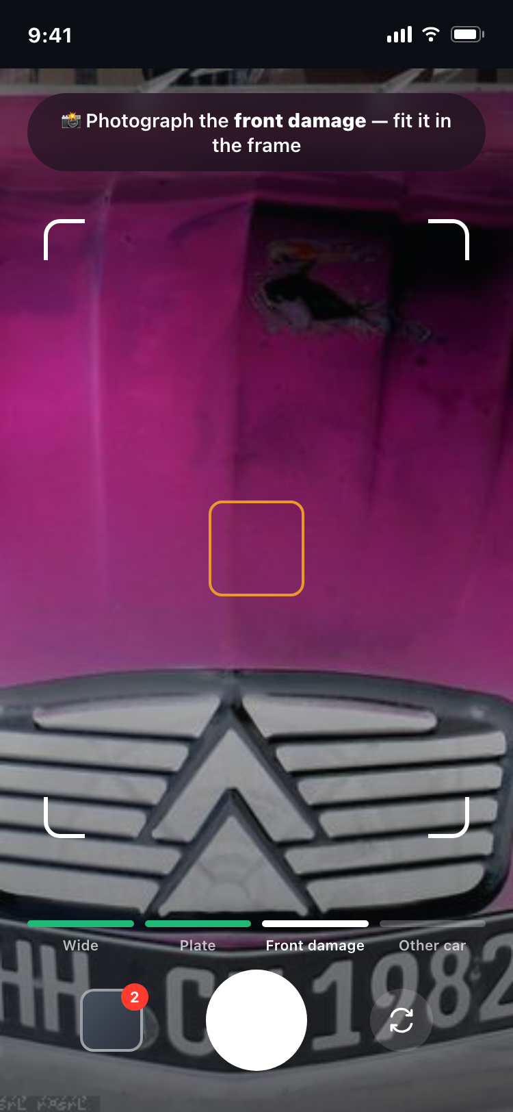
Turo & Lemonade claim flows confirmed the pattern: a step progress bar, guided photo capture with a "why" nudge, and a final review-and-submit.
What the references changed
Pulling real FNOL (First Notice of Loss) flows surfaced gaps in my first cut — things real claims apps ask for that I'd missed. These are queued for the next iteration:
- "Describe what happened in your own words" — a free-text step both Turo and Lemonade include.
- Documents — police report / the other party's insurance details, not just damage photos.
- Vehicle status — "is it drivable / where is it now," which matters for the roadside context.
Two choices are deliberate POV, not convention: leading with a safety triage screen (most apps bury "accident tips" in help), and a structured form flow rather than Lemonade's conversational chatbot — the form reads more "banking," which fits the brief.
From the home screen's red CTA, the report runs as a focused modal flow with a persistent 10-step progress bar — so a stressed user always knows how much is left.
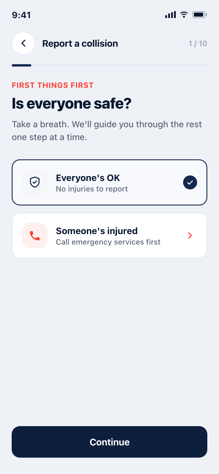
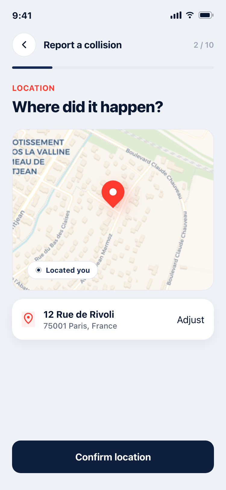
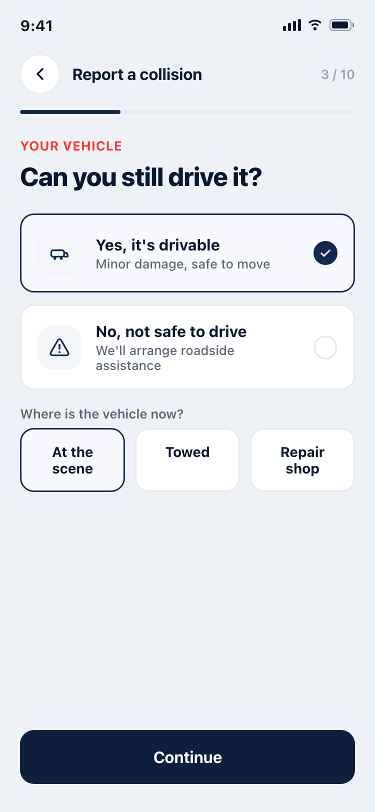
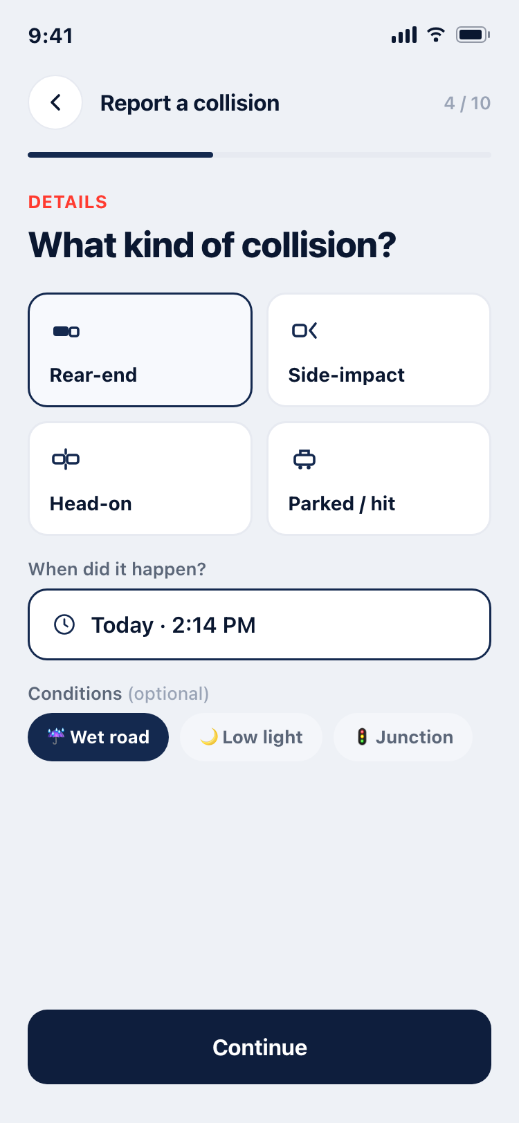
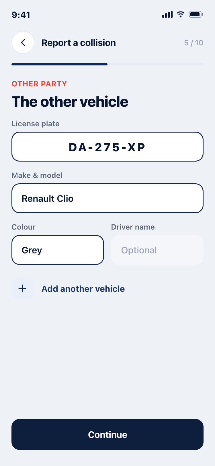
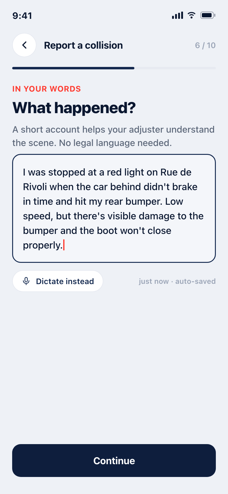
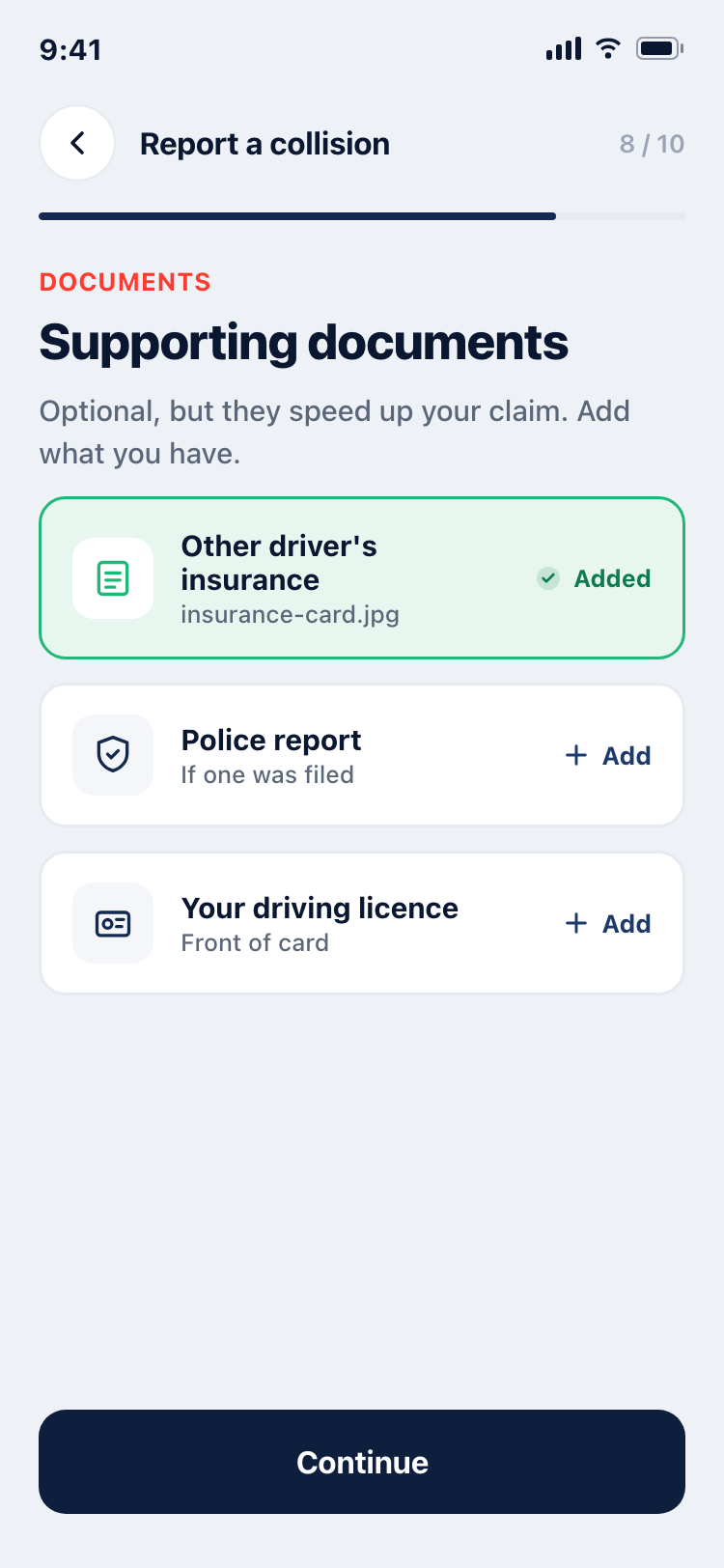
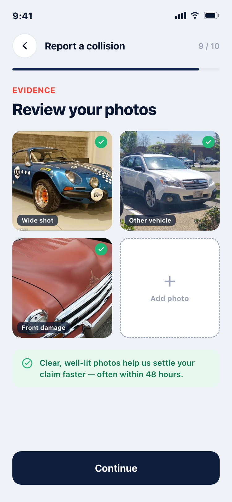
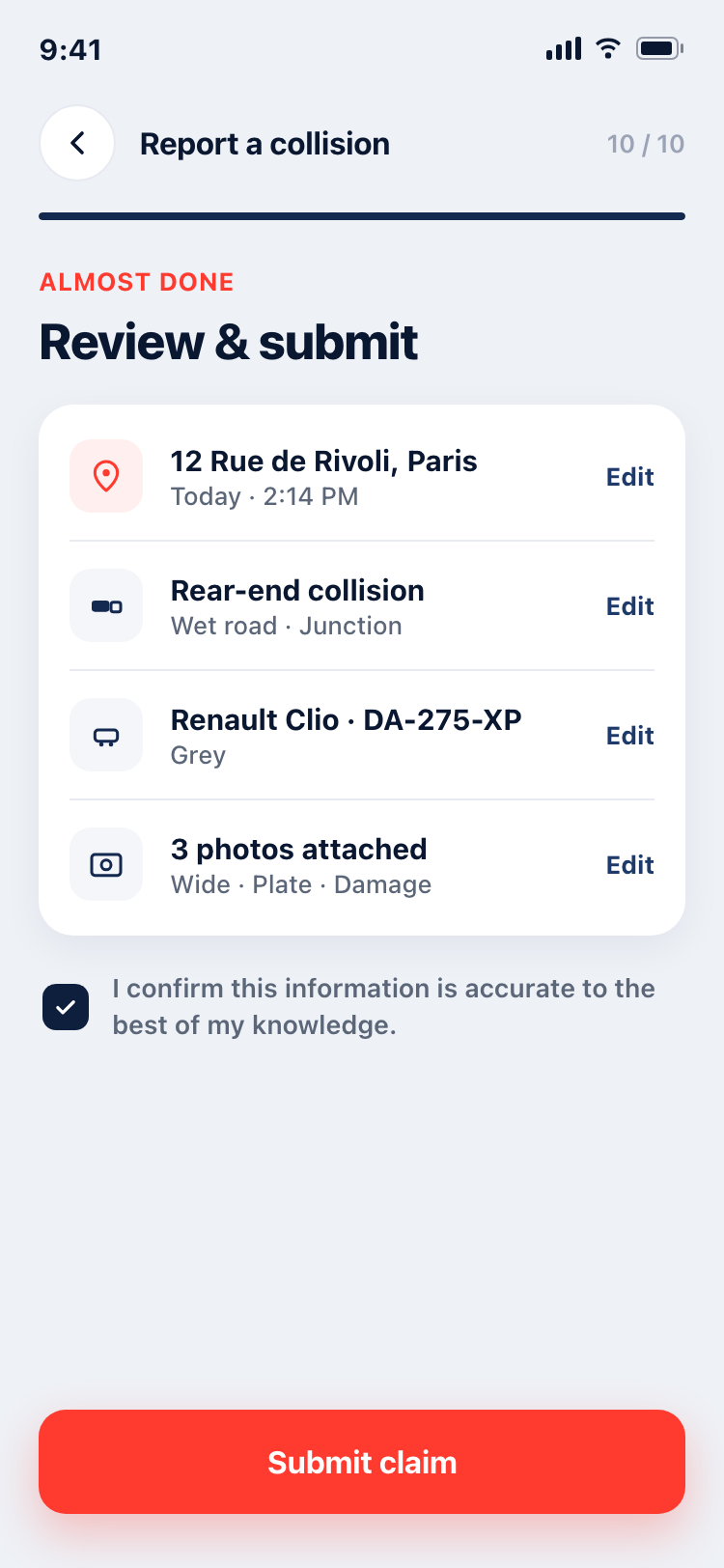
Two moments I cared about
Safety first
Step 1 isn't a form — it's "Is everyone safe?" with a one-tap route to emergency services. The emergency-service half of the brief, made literal.
Guided capture
A dark camera screen with a viewfinder frame and a shot checklist — turning "take photos" into a guided, confidence-building task. Good evidence settles claims faster.
Under the hood, this project also tested a method: instead of drawing screens in Figma, I built them as real, structured HTML/CSS (every value a design token, every icon a vector), then imported them into Figma with html.to.design — landing as fully editable layers ready to become a component library.
tokens.css, semantic structure, inline-SVG icons
Sharing one tokens.css across all screens means colours and components
de-duplicate on import — the same navy and the same button arrive in Figma as
one style, not nine copies. The pipeline proved out at near pixel-perfect fidelity; the
component/variant/token work is the deliberate manual "design-system" step that follows.
Tokens, not hex codes
Every screen draws from one token set, so the system is consistent by construction — and imports cleanly into Figma as shared styles.
#0A1730 · trust / headers
#FF3B30 · primary action
#1FB877 · success / safe
#EEF1F6 · background
- Type: SF Pro (native iOS) with an Inter web fallback.
- Components: status bar, app bar, stepper, buttons, cards, selectable options, form fields, list rows, photo thumbs — all reused across screens.
- Radius & spacing: a 4-pt spacing scale and a small radius set keep everything on grid.
The screens are wired into a tappable browser prototype — start on the home screen, hit the red "Report a collision" button, and walk the full flow through to a submitted claim.
Code-to-Figma is viable
Well-structured HTML imports into Figma at near pixel-perfect fidelity. The pipeline is real — the manual part is the design-system layer (variants, variable binding, naming), exactly where a designer should be spending the time.
Grounding beats guessing
Separating brief-given from invented, then checking inventions against real FNOL apps, turned a plausible flow into a defensible one — and exposed the gaps (free-text, documents, vehicle status) worth fixing next.
Stretching into native iOS
A deliberate step beyond my B2B-web comfort zone: SF Pro, iOS status bar and tab patterns, safe-area thinking, and an emergency-grade interaction tone.
Next: close the three reference-driven gaps, build the full Figma component library + variants from the import, and wire native transitions/micro-interactions in Figma's prototype mode.